Research-Target Audience
1/27
Hi blog! I have super exciting news, I finally decided that my genre will be fitness lifestyle! Today, I will be researching the target audience for this amazing genre. Your target audience is a group of people most likely to buy your goods or services. By understanding your ideal customer base, you understand their wants and needs and how to best cater to them. Through the target audience, you can fine-tune your brand and develop effective marketing campaigns, and help to connect with those target customers.
Target Audience VS Target Market
The terms target audience and target market are very closely related but have very different meanings. A Target audience is a narrow segment within a broader target market. It is defined by shared characteristics like demographic graphics, behavior, and interests. On the other hand, the target market refers to the overall group of people or business that the companies wants to reach out to and serve their products to. This includes potential customers who share common needs but have different demographics and preferences.
For example, for Fitness lifestyle magazine, to correctly identify their target market, you need to look into the total number of people spending money on fitness. In 2025, about 75 million dollars was spent on gym membership, which is roughly 25% of the US population. Primarily of these health-conscious individuals are 18-45, and they are often motivated by wellness, weight management, and active living. The audience includes fitness enthusiasts, beginners, athletes, and those seeking nutritional advice and mental health support. Often living in urban/suburban areas with disposable income for fitness-related products. Statistically, about 30-40% of fitness magazine readers are college graduates, which means the writing can use more technical vocabulary rather than vague wording.
The target audience for a fitness lifestyle magazine is the audience you are trying to target with a particular message or feature. We look at the psychographics of buyers, we look at WHY they train and HOW they are motivated. For example, if you cover is a super strong and muscular man, then typically men or women who want to become 'shredded' or get super strong are more liking to pick up that magazine rather than one on meditation. The best magazines look for the pain point of their audience and try to offer a solution.
Stats
Next, I will be analyzing some basic states for fitness lifestyle magazine buyers.
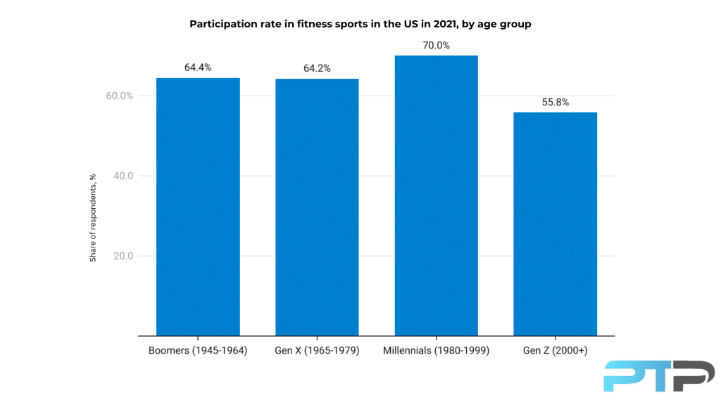
AGE: 26-42, this is the Millennial-Gen Z bridge; they have the highest disposable income and the highest gym attendance.
EDUCATION LEVEL: Bachelor's Degree or higher; they are often highly literate and prefer articles backed by science and data rather than myths.
MARTIAL STATUS: Single or partnered (Domestic Partnership). They typically do not have children yet, or having very young kids means they still have time for self-investment.
GOALS: Functional Fitness and or stress reduction
MEDIA CONSUMPTION: Social Media like TikTok, Instagram, and sometimes Facebook, offer quick workout tips or how to fix form.
HOBBIES: Niche Sports: pickleball, biking, and hiking.
$$$: Average subscriptions for subscriptions like Men's Health or Women's Health can range anywhere from 100-150$ a month.