Friday, February 27, 2026

Production- Finishing Cover

 Production- Finishing Cover 

2/27

I have OFFICALLY finished my cover, and I absolutely love it!


Finishing Up Puffs and Coverlines

    I created a bunch more taglines all over the magazine. I did phrases like "Feel the burn" and "#1 workout for beginners." I use a combination of Akira for bold and eye-catching phrase and used Mirosoft to give context to the bolder phrases. 

Creating Barcode

    For some reason, creating the barcode was the most challenging part. Because the backround was so dark, none of what I found would work. I even tried white ones, but I wasn't to in love with how it looked. Then I decided to try and put a white box under the barcode and layer it on top and it worked perfectly I was super happy. Under the barcode I added the price, I added it there because it made the most logical sense to me.  

Struggles 

    The one real struggle that I had was deciding how to make the cover look aesthetic. I am not the best at designing so I kept second guessing myself and kept rearranging literally EVERTHING. However I am super proud of how the cover came out!!


Production- Cover

 Production- Cover

2/27

    After I officially decided on my color, I was ready to start creating my cover. 

    To begin, I started relooking over my inspo that I had saved on Pinterest. I knew I had to have a bunch of different puffs and taglines to keep the reader engaged and wanting to read. I decided to start off by creating a tagline for my feature article. I decided to use the phrase "why sleep matters." I use my Akira font to create some hierarchy. I made sleep the largest word and centered it.  I placed it on the far left because I had more space to work with. 

    Next, I wanted to create a puff because I plan on selling my own workout equipment and clothing in the magazine I wanted to advertise it to, so people who know.  I used the phrase "Go Shop!" in my Akira font and in a font called Mircosoft I stacked it below. The phrase said "Workout Wardrobe Steals."

    I plan to change the Microsoft font because I feel like it does not look the best with the Akira font. This was all that I worked on on Wedenday, I am super exciting to finish to cover. 

This is what I have completed so far!!!


Production-Creating the Cover

 Production-Creating the Cover

2/27

Hello Blog! I originally started my cover on Monday, and I am just getting around to writing my blog post today because I have been super busy. 

    Uploading

    I originally uploaded my cover photo with the intent to go sky blue as my theme color. However, when I uploaded the photo, I realized I hated it.... To confirm I really did hate it, I tried playing around with it. I attempted to do a blue outline with the title "total fit" and mess with the placement, but I felt like the sky blue was not the right color. 


    Color Picking 

       Because the background was very dark, I was thinking I needed a bold color to make the title stand out. I thought that red would be perfect since there was already red in the background. I decided to color-pick it. I am not going to lie, the color picking was hard to figure out... I need to watch a YouTube video. I found that to highlight the word and THEN press on the word to color it. I selected the red from the tape on the floor, and it came out way more burgundy than I wanted it to. I played around with the red, but ended up not liking it. I was considering white to contrast the background, but I decided to move the eyedrop tool around the picture and see if any color interested me. 

    I ended up really liking the women's pick top. I felt like the color was perfect. I really liked the contrast that the color gave; it gave a welcome and calm vibe. Ultimately, I chose to use this color for my cover. 


Friday, February 20, 2026

Production- Taking the Photos

 Production- Taking the Photos

2/20

    Hello Blog! I have super exciting news, today I started my production process. I arrived at Inferno Fitness and took my photos. 

Preping 

    I decided to take the photos right after school, because the gym is located in Deerfield Fl, and I do not drive on the highway, it took me over an hour to arrive. I prepared by charging the camera I was going to use, which was my Canon T8i, and organizing my questions. Once I arrived, I was ready to begin. 

Feature Article

    As I have discussed before in my logs, my feature article is going to be split into two pages. On the first page will be an article about the importance of sleep, and the other page will be a step-by-step workout guide for beginners. I started with the feature article. I began asking the coach to pose standing straight. I took a couple of shots, but he just looked awkward. So I told him to cross his arms and turn slightly to the right without moving his head. This looked way more natural, and I really like how these photos came out.  After I took the picture, I began asking him questions about the importance of sleep. I asked him, "How does a full night of rest affect your body?" "How many hours should one get a night?' and many more. He answered well and I was happy with the interview. 

    Next, I wanted to create my step-by-step beginner friendly full body workout. So I started with the interview because I felt like it would be easier if he could create a workout in his head and then physically demonstrate it. So he came up with 4 different exercises. To start, I began my interview with him asking about the workouts. I asked him questions like "What is the benefit of these?" and "How many reps should they do?" After I was happy with the interview, I began with the photos. I knew I wanted to make them a cutout, so I tried to locate him where the background would be easy to cut out. I originally took the photos on my Canon but hated them... so I ended up switching to my phone camera, which worked out fine. I took tons of photos and then sat with the coach, and we picked out the best photos. 

Here are some: 


Cover 

    Now this was the photo I was stressing the most about. I knew it had to be a single shot and eye-catching. I felt like I had taken hundreds of photos and was about to give up. I took photos of people working out with dumbbells, doing lunges, literally everything you could think of. Eventually, I took pictures at the cable machine, and I LOVED this angle. I 100% knew somewhere here was going to be my cover photo. AND BAM: 


    I love this photo, I am so excited to use it!!!


Planning- Project Proposal

 Planning- Project Proposal 

2/20

Hello blog! Welcome to my project proposal! 

Introduction 

    Hello! My name is Thea Larragoite, and I am a senior this year. I will be working alone on this project and will be creating a fitness lifestyle magazine. 

Magzine Genre

    I have chosen to create a fitness lifestyle magazine because I love staying active and going to the gym, and I wanted to be able to display my love for exercise. I chose the subgenre lifestyle because it gives me more flexibility with my content. With the lifestyle genre, I can focus on other things instead of fitness, like the importance of sleep and dieting. I felt like the combination of these two genres allowed me to make my content more inclusive to everyone. 

Target Audience  

    My directed target audience will be young adults, ages 20-40. I want my magazine to be directed towards beginners. I really want to provide content for a range of different people in every step of their fitness journey. I chose the age gap 18-30 for two main reasons: one, I want to make sure they have a stable income and can keep consuming and engaging with my magazines; I also plan to promote my own fitness brand, equipment, and nutrition brand, so I need to make sure they can be able to afford my products.

Repersentation 

    My magazine is meant to represent a wide variety of people, different body types, and fitness levels. Instead of focusing on athletics, I wanted to cater my content towards gym beginners. I want to create the feeling of inclusion for all.     

Software/Hardware

    I plan on using a Canon T8i Camera with a 135mm lens for the candid photos. I will be using an app called Otter to record the interviews. For my editing software, I plan on using InDesign to create my final magazine.

Basic Plan for Magazine 

     In my magazine, I want to cover basic gym workouts to get my customers comfortable in the gym. I will include a 4-day gym workout, with each day being a different muscle group. For example, Monday will be back and biceps, Wednesday will be legs and glutes, Friday will be arms, and Sunday will be cardio and abs. I plan on giving them 4-6 different workouts on each day, with pictures to assist them.  I want to do my feature article on a new gym owner giving advice for gym beginners, as well as sharing their story of opening a brand new gym. 

      On my cover, I plan to play with typography. I want to cover to be engaging and fun. I will be picking a bold font and using the layering effect. I plan of capturing a a candid photo in the gym and will be using my subject to overlay the words. For my colors, I plan on using sky blue to promote a feeling of inclusivity and 'welcome'. 


b.                             Gym sport exercises fitness and healthy lifestyle infographic set vector  illustration Stock Vector Image & Art - Alamy


Wednesday, February 18, 2026

Planning- Feature Article Rough Draft

 Planning- Feature Article Rough Draft

2/18

Hi blog, super exciting new I have created a rough draft of my feature article!!! As I previously stated, I will be using InDesign, so today I created it! 


Here you go!!!


Details 

    To start off, I selected a cartoon stand-in as a photo that similarly represented the model I would be using. I put him in the center of the page and then began to work on the headline. Like I stated in my style guide, I will be importing the font Akira from dafont.com. So I logged onto the website and found my desired font. I then downloaded it to them, compared, and successfully integrated the font into the app. After I downloaded the font, I started coming up with headlines. I knew I wanted it to be inviting and bold. Orginally I liked the name"the first 30 days" because that is exactly what the article would be about. 
    
    Then, after some more searching, I came across the name "Starting Strong." I really liked this name because my feature article is about the importance of sleep and how it directly affects your workouts/recovery. 

    After I created my headline, I started learning how to textwrap. At first, I was very confused, so I had to look to a short YouTube video. After watching it, I learned that you go through the window dropdown on the top toolbar, select the photo, and then press text wrap. Then I dragged the text over the photo, and it perfectly wrapped around the subject's body. 

Feature Details 

    After reviewing the photo, I realized that I need to add some more padding around the photo. It feels cramped, crowed and suffocating. For my real feature article, I plan on adding at least 10 spaces of padding to make the picture less crowded. 

    I also need to add my dropcap to the first letter once I write the article to break up the text-heavy article. I need to make the first letter sky blue, my theme colors, and also add color to my headline. 


Thursday, February 12, 2026

Planning- Feature Article

 Planning- Feature Article 

2/12

    Hello Blogggg, I am back. Two articles in one day! Today, I will be planning out the questions I will ask for my feature article, showing my visuals, and lastly showing a rough draft of the design I want to create. 

Potential Article Types  

    As I have stated in past posts, I want to do my feature article on one of the coaches at Inferno Fitness. I will be asking them to provide me with a beginner-friendly workout routine. I had three possible article pathways that I could potentially follow. The first one I considered was 'Expert Driven Piece' this highlights proven skill and focuses less on the person's life and more on their perspective or viewpoint on a specific topic. This is the scientific or strategic framework behind the routine. It focuses on proving that workouts are a calculated system. The second article type I was considering is the profile of the coach trying to get the customer to 'buy it'. This focuses on the reading behind the workout style and connects with the coach's specific history. The last article type I am considering is the How-To Feature article. This is a manual for the workout; it is what the client uses when they are physically in the gym. It focuses on execution and logistics. 

    After carefully reviewing what I want my article to portray, I have decided to go with the How-To feature article. I think this will be the most effective for beginners. I will have two basic steps for each workout. I will first list the workout and how many sets or reps are to be completed. Then I would explain the reason why they are performing this, for example 
-Single Leg Press x10
-This workout is meant to target each leg and fix muscle imbalances while building lower-body stability. 
    Instead of having one photo in the middle, for the type of article I plan on doing, I think each workout will need a physical demonstration like this. 


                                               Workouts Perspective Total Gym Fit Exercise Chart Resistance Workout Total  Body Project Workout Resistance A High 


Questions    

    I think the easiest routine for getting my photos will be asking the coach to give me a routine for a full-body workout. Here are some of the questions I will be asking. 

Can you state your first and last name? 
Tell me a little bit about how Inferno Fitness got started?
How long have you been coaching for?
How do you think you offer that is different compared to other coaches?
Can you provide me with a beginner-friendly full-body workout routine? 
Can you explain the logic behind each workout?
What should a beginner do to help their body recover about this workouts? 
How many times should a beginner be working out, and why is it important to listen to your body? 

    If I need to, I will ask as many follow-up questions as I can, that why I can write an informed article. 


Visuals 

    Idealy the coach will provide five full-body workouts. I plan to divide the page horizontally and switch the photos from left to right. Each of the workouts will be clearly demonstrated with a corresponding visual. The workouts will be highlighted in sky blue in Akira, and the description will be down below in regular font. I plan to structure the article a lot like the picture I included above. These workouts will be on the left side of the spread. On the right side, I plan to do a profile on the coach using some of the other questions from above. I plan to structure it on the importance of recovering properly after using your body. This will be a full-body shot of the coach with text wrapping around him. I will use a drop cap for the first letter and make this profile visually pleasing. This feature article will be displayed as one of my puffs on my cover. 

Rough Draft

    This is what I ideally want my feature article to look like. 

                 Text Wrap in Adobe Illustrator in Just 1 Minute || Magazine / News-article  Design
This would be the left of the magazine. However, I would like a full body shot of them standing. 


Step Box Workout Poster PDF, Aerobic Step Cardio Exercises Chart Printable,  Home Gym Full Body Workout Wall Art, Bodyweight Fitness Poster - Etsy ...      
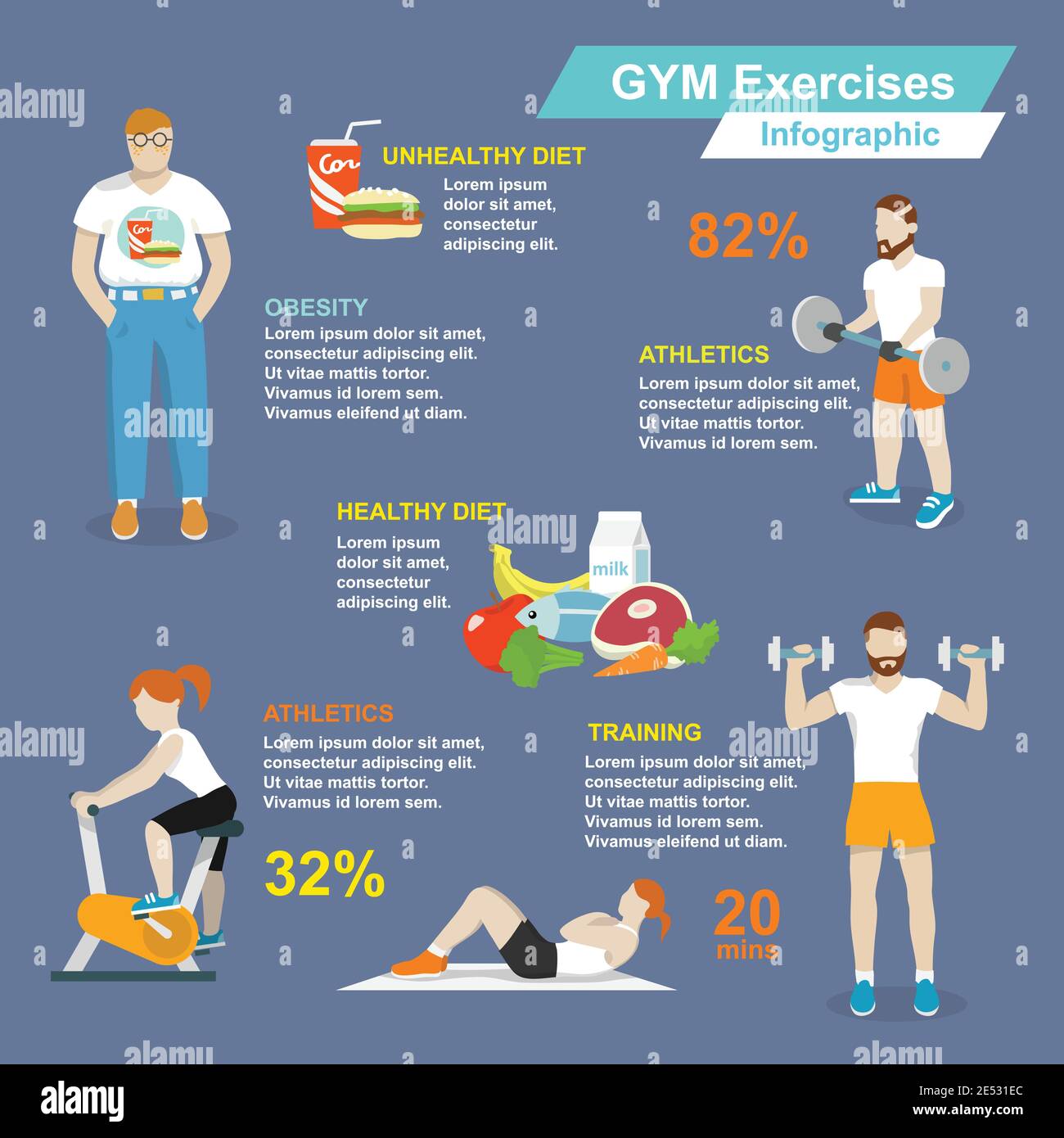
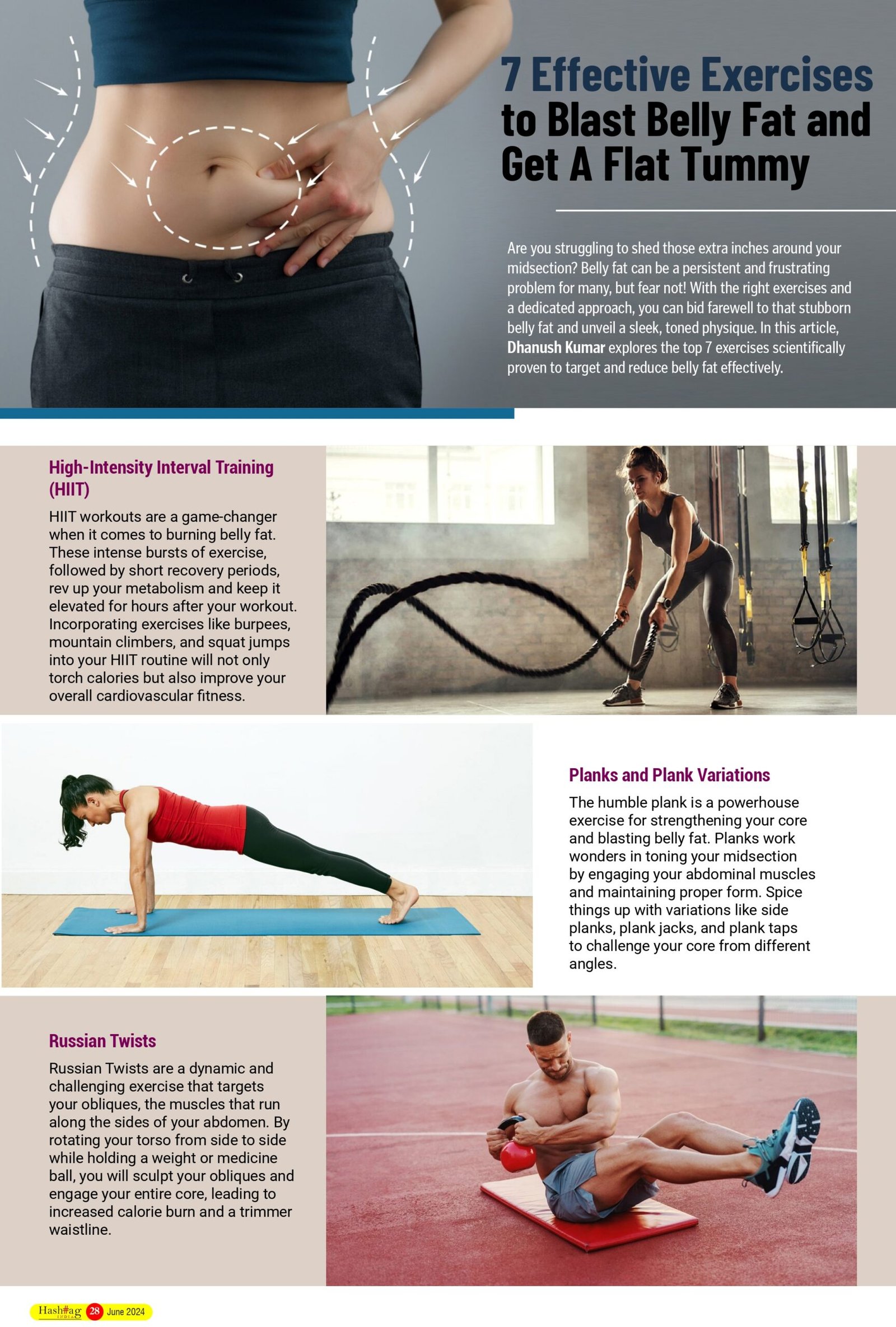
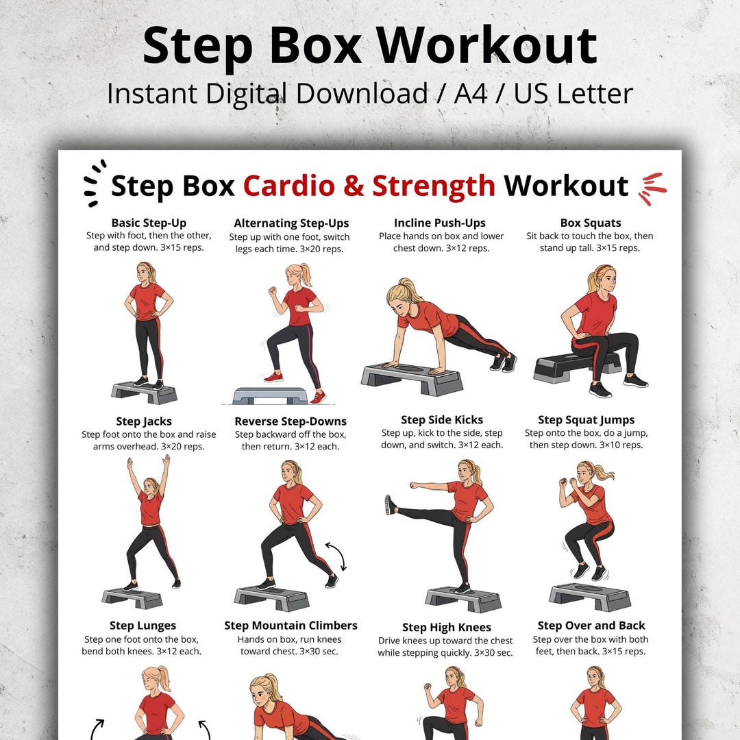
This would be my right side, real visuals to follow. 


Planning-Location/Mise-on-scene

 Planning-Location/Mise-on-scene

2/12

    Hello blog, today I will be researching the gym in which I plan to take pictures. The gym is called Inferno Fitness and is located in Deerfield Beach, Florida. I will research what time they have classes, and I will contact the coaches to schedule a time to come in to photograph and interview them

    Schedule

    They have multiple different class times a day. Here is a list of their slots throughout the day.
5:00 AM
6:00 AM
7:05 AM
8:30 AM
9:30 AM
12:00 AM
4:15 AM
This gym works by circuit routines. They set up eight different stations, with each station having two different workouts. Each day is a new muscle to isolate. Here is their schedule. 
Monday: Lower Body
Tuesday: Upper Body
Wednesday: Full body 
Thursday: Lower Body
Friday: Upper Body
Saturday: Glutes
Sunday: Closed 

    After speaking with the owners, they told me the best time to come in would be around 12:00 on Saturday. They said this because the class gets relatively full, and I will be photographing a lot of people. On Saturdays, they close at 1:00 PM, so I will easily be able to conduct an interview after hours without distracting anyone. 

                            Inferno Fitness

  Mise-en-scene

    After further looking into the gym, I found out that the gym is in a warehouse. This is GREAT news because at 12:00 the lighting will be amazing. I am preparing to see a lot of gym equipment, from pictures, it looks like they have a leg press, lots and lots of dumbbells, workout bands, benches, and mirrors on the walls. I assume everyone will be in workout clothes and tennis shoes. I also assume I will see a lot of water bottles and towels meant for sweat. This gym has a huge mural on the wall of the only and only Arnold Schwarzenegger flexing his muscles. I think a really cool picture would be someone aligned with him working out, doing a similar pose. If I can someone get this photo? I would 100% make this my cover!! 


Wednesday, February 11, 2026

Planning- Production Timeline

 Planning- Production Timeline

2/11

Hello Blog! Today, I will be planning out my production timeline. I am doing this to stay organized and be as efficient as possible. Planning this will help me to avoid last-minute cramming that will lead to unwanted errors. I am definitely a perfectionist and need everything to go my way, so this will be a huge help! 


Week of Feb 16

    During the week of February 16 to February 22, I will still be in my research phase. I plan on researching location/mis-en-scene and layout. For location/mis-en-scene I will be researching the gym in which I plan to take pictures. The gym is called Inferno Fitness and is located in Deerfield Beach, Florida. I will research what time they have classes, and I will contact the coaches to schedule a time to come in to photograph and interview them. For the layout, I will be planning a rough draft of how I want my cover, feature article, and table of contents to look. During this week, I would also like to make a mood board of all my colors and fonts. 

Week of Feb 23

    Technically, the week of February 23 to February 28 is also designated planning time. Overall, I feel pretty strong about my planning process. I have created my style guide, planned out my layouts, and created rough drafts. This week, for my blog entry, I will be planning out and nailing down last-minute touches like spacing rules and tedious things like that. By doing this, I think it will help make my magazine the best it can be! 

Week of Mar 1

    This is SUPER exciting because this week I will officially begin my production process. This week, I plan to drive up to Deerfield and take photos and get interviews. I plan on using a Canon T8i Camera with a 135mm lens for the candid photos. I will be using an app called Otter to record the interviews. While I am at the gym, I plan to take a lot of photos. I will most likely start by observing the class and finding a workout that looks engaging and photo-ready. I plan to take photos of many different people and workouts and then select the best and most captivating one. Next for my feature article, I will have a sit-down interview with one of the coaches and ask them questions about an ideal beginner-friendly workout. After we finish our chat, I will then ask them to demonstrate one of the workouts and use it as my cover photo. For my table of contents, I will have a posed photo of the owner, and next to them will be information. 


Week of Mar 8

    After I collect all my photos and choose the ones I like the most, I will begin planning in InDesign. I will start with my cover because I feel like it is the most important. I will use my Akira font and 3D layering effect. I will arrange the puffs and plug how I want, and make the cover up to my standard. InDesign may be a little difficult to navigate, so I plan to watch YouTube tutorials to help me have a better understanding of what I am doing. I am super excited for this part because my vision will finally start to come alive. Hopefully, by the end of the week, I have finished my cover and will start to work on my feature article. A feature article is more text-based rather then design based, so I feel like it will not take me as long.  

Week of Mar 15

    This week is crunch week; this is my final week before submission. I will need to finish my table of contents by at latest Wedensday, so I have the rest of the week to tweak and polish my final designs. I will spend the majority of this week editing and making sure everything is perfect before I submit. I will try to work on this throughout the week, so I am not stressing over the weekend. 


Friday, February 6, 2026

Planning- Style Guide

 Planning- Style Guide

2/6

    Hello Blogggg, today I will be creating my style guide for my fitness lifestyle magazine. My last two entries have been about deciding what fonts and colors to use today. I will be finalizing everything. 
    

General 

    -No use of contractions, to ensure this magazine conveys a professional and sophisticated image, I will refrain from using contractions in all articles and headlines. 
-No use of modern-day slang, slang is deemed as improper, and to successfully maintain a professional image, I need to avoid it at all costs.
-Excessive use of passive voice using passive voice sentences makes them feel slow and unclear. Using the active voice creates energy and makes your articles easy to understand.
-Avoid filler words (like, super, etc), filler words weaken the point you are trying to make and come off as unprofessional. 


Overall Theme/Message 

    My overall theme for my magazine is beginner-friendly. I want my magazine to feel welcoming to all, no matter where you are in your fitness journey. I want to convey the message of inclusion and 'one stop shop.'  Fitness should not be intimidating. This magazine creates an environment where every reader regardless of their current ability, feels empowered to begin. By offering expert advice on nutrition, movement, and mindset, we act as a definitive guide for your entire journey. That is why I chose the name Total Fit. 

Colors and Fonts 

    I chose the color sky blue as my main theme color. I chose this because traditionally blue conveys a feeling of calm and tranquility, which alings perfect with my message. 
-Sky blue is the color of a clear morning. This visual connection reinforces your theme of a new beginning. It suggests clarity and a clean slate. Traditionally, blue establishes credibility, and once trust is built reader will be more likely to engage with the magazine. 
-Accent colors include stone and navy blue. 
-The font I use is called Akira. It is a font I found on dafont.com and plan to upload into InDesign. I chose it because it is a clean, readable font to portray the message of inclusion, high energy, and gender neutrality, making it visually pleasing and leaving a good impression on customers.  

Headlines/Puffs/Plugs

 -For my article masthead, I will be using Akira in the color sky blue. 
-All my headline with my left alinged at the top of my page. 
-All headlines will be layered behind the main photo, allowing the photographer to grab the reader's attention.
-All puffs or plugs will be in either Akria font or the font family of Akria wether that is a light or italics version. 
-All puffs or plugs will be in Sky blue or other complementary blue colors. 

Feature Article 

-Photos will be texted wrapped. 
-Drop Cap will be on the first letter of the article. 
-"" will be used on the page as visual elements, which will highlight the important message in the article or an inspirational quote. 
-Below is an example of this. 

                                                  Feature articles - samples - Guy Nicholls


Table of Content

-  For my table of content Akira will be the headline font choice.
-A larger page number will be in the color sky blue. 
-Regular fonts will be a contrasting font.
-Regular fonts with info on the article will be directly under the larger fonts


Wednesday, February 4, 2026

Planning-General Information

 Planning-General Information 

2/4

Good Morning blog. Today, I need to get my life together, so I will be planning out general information. I will be planning out my publication's names, what fonts and colors I would like to use as my visuals for the table of content

Publication Name

    For my publication name, I knew I wanted it to represent power and strength. I wanted to choose something bold and memorable.  Because my magazine is targeted for gym begingers I wanted to make the title inviting and calm. I really like the idea of using either the word active, fit, or something with the word drive. I really like the names Total Fit and Daily Drive. To me, total fit portrays the vibe of an 'all-in-one', which aligns well with my magazine because I do want to include not only fitness but also nutrition and recovery resources. I want my magazine to have all the information and act as an one stop shop. I also really like the name because it does not sound like it is meant for a bodybuilder or an elite athlete; it feels like a magazine for a normal person trying to get in shape. Next, the name Daily Drive to me means the same as more of an energizing, and conveys a feeling of motivation. I feel like this shifts the focus more towards high intensity and goal-oriented. I still really like this name, but I am unsure if it conveys the message I am trying to tell. I think I have officially decided to go with the name Total Fit because I feel like it betters alines with my message! 

Fonts and Colors 

    Now that I have chosen my name, Total Fit, I want to find colors and fonts that portray my message of accessibility and balance. I want the message to be a 'you belong here'. I want to portray an all-inclusive and welcoming vibe to people of all different exercise backgrounds. I knew early that I wanted to use red; however, I have decided to go a different path. I want to use a nice sky blue with an accent of a darker, muted color. 

                                                           Light Sky Blue
  
    For fonts, I need them to be clean and readable. I 100% want to do a sans-serif font. These fonts feel open and welcoming, and are also known for their great readability across both digital and physical magazines. I think this font sends out a message of high energy and gender neutrality, making it visually pleasing and leaving customers to buy Total Fit magazines. I think for my font I will be looking at dafont.com and then importing it into InDesign. I want a font that is bold and placeful but also conveys a feeling of professionalism. For fonts, I really like Akira, I would use this font for headlines and the table of contents. I really like this font because it is bold and wide. It dominated most of the white space, and I feel like it an eyecatcher. I am still unsure of the secondary font I want to use for articles, but I will most likely find a contrasting font on InDesign. 


Table of Content 

    For my table of content I definitely want to use Akira as my font choice. I want the left side to be my table of contents and the right side to be a message from either the author, aka me, or from a nutritionist. I am still unsure. However, for my TOC I want to have a cutout of a candid photo of an athlete working out on half of the page, and right next it to I want a block of sky blue to the bottom of the page. Layered on top of the blue box, I would use my Akira to label the page number, and directly below would be a summary of the article. The font for the summary will be the same as the article font. It would look something like this. 

This is a very loose idea of what I want, the cutout will be on the same page as the TOC. 


Monday, February 2, 2026

Planning- Magazine Content

Planning- Magazine Content 

2/2

    Hi, Blog. Super exciting news, I have officially begun my planning period! I will begin to plan out my content for my fitness lifestyle magazine. 

Directed Target Audience 

    My directed target audience will be young adults, ages 20-40. I want my magazine to be directed towards beginners. I really want to provide content for a range of different people in every step of their fitness journey. I chose the age gap 18-30 for two main reasons: one, I want to make sure they have a stable income and can keep consuming and engaging with my magazines; I also plan to promote my own fitness brand, equipment, and nutrition brand, so I need to make sure they can be able to afford my products. In my magazine, I want to cover basic gym workouts to get my customers comfortable in the gym. I will include a 4-day gym workout, with each day being a different muscle group. For example, Monday will be back and biceps, Wednesday will be legs and glutes, Friday will be arms, and Sunday will be cardio and abs. I plan on giving them 4-6 different workouts on each day, with pictures to assist them.  I want to do my feature article on a new gym owner giving advice for gym beginners, as well as sharing their story of opening a brand new gym. 

Viusual Element

    On my cover, I plan to play with typography. I want to cover to be engaging and fun. I will be picking a bold font and using the layering effect. I plan of capturing a a candid photo in the gym and will be using my subject to overlay the words. For my colors, I plan on using red to promote a feeling of adrenaline and 'rush'. I will make sure the cover has a red background and a red masthead. I plan on using InDesign to do this. All first letters of article with have a drop cap for the first letter. This will help to break up text-heavy paragraphs and help to signal to readers that it is the start of the article. I will be using puffs and plugs on the cover to provide contrast to the cover as well as to help readers find interest in my magazine and want to pick it up. 

Content 

    I already discussed my plan to provide an article on workout plans for 4 days of the week. I also plan to do a column on nutrition I will do this by creating an infographic, and I will be addressing food substitutes. For example, there will be a photo of a bowl of ice cream and then an arrow pointing to the healthy substitution of Greek yogurt with fruit. I will then provide the benefits of Greek yogurt: high protein and muscle health. I will do this for a couple more foods. Some ideas I have are spicy chips with the substitution of carrots with lemon, and fried chicken with the substitution of grilled chicken. This is my inspo 
                                                       Living a healthy lifestyle doesn't have to be difficult. Little changes can  help lead to a balanced diet and a more healthier you.💪 Here are some food  substitutions that aid in your   


    I know I already discussed my feature article, but I wanted to go further in-depth. Like I already said, my feature article will be on a new gym owner giving advice for gym beginners. I plan for the visual to be the demestarting one of the workouts, and I will use their body to text wrap the words. Below, I have attached my inspo. I would want the subject to be in the middle and their quote surrounding them. I feel like this is super unique, and I am super excited to do it! 


           Wrapping Text Around Graphics and Photos in Illustrator CC


CCR Questions

  Question 1 Question 2  Question 3 Question 4